THE MAP
This interactive visualization was created by Natalee Desotell as a practicum project for the UW-Madison GIS & Web Map Programming MS program. This map was created using Carto Engine, Leaflet, and copious amounts of caffeine. The choropleth colors are from Colorbrewer, and the icons were created in Adobe Illustrator.
THE DATA
The data were provided by Erik Munson, Ph.D., D(ABMM). This map is based on 2009, 2013, and 2015 E. Coli susceptibility data from across Wisconsin. These data were aggregated to the county level. Then, a weighted average percentage susceptible was calculated based on the number of isolates tested in each lab.
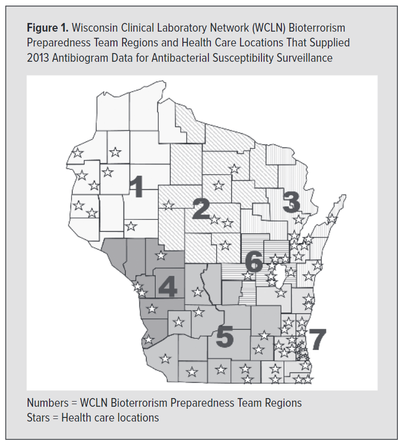
Permission was granted to show 2015 data at the county level, but the same cannot be said for earlier data. To maintain patient privacy, 2009 and 2013 data are aggregated to the Wisconsin Clinical Laboratory Network's seven Bioterrorism Preparedness Team Regions. The choice to aggregate to these regions is based on original research by Erik Munson, Ph.D., D(ABMM) et al.
THANKS